The energy drink category has undergone a significant shift. As consumer preferences evolve toward intentional purchasing decisions, beverage operators and retailers are seeing a clear opportunity: products built around better ingredients, premium positioning, and distinctive packaging now command stronger shelf presence and customer loyalty.
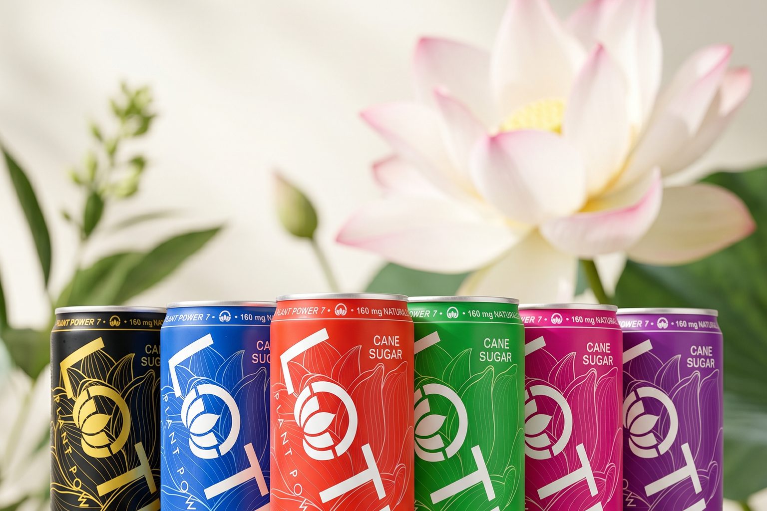
Lotus Plant Power was built directly for this market shift. The brand combines plant-powered ingredients with a distinctive color-driven packaging system designed to evoke curiosity, drive trial, and build brand identity in one of the most competitive categories in beverage.
The Ingredient Foundation: Plant Power 7™ (PP7™)
At the center of every Lotus Plant Power drink is Plant Power 7™ (PP7™), the brand's proprietary blend of certified organic plant-based ingredients. The formula brings together functional botanicals including green coffee beans, guayusa, green tea extract, coffee fruit, elderberry, Jerusalem artichoke, and ashwagandha KSM-66.
This ingredient story matters to operators for a clear reason: today's consumers read labels more closely and look for ingredients they can feel good about. Products with clean, plant-based formulations resonate with a broader demographic than traditional high-caffeine energy drinks, expanding your addressable market and reducing inventory risk.
The formula delivers functional energy while addressing the consumer shift toward wellness-oriented products—a critical advantage as purchasing decisions become more intentional.
From Product Design to Packaging Strategy
Where Lotus differentiates itself in the channel is through packaging that functions as brand identity, not just flavor communication.
Most energy brands treat colors as temporary flavor labels. One can is watermelon. Another is cherry lime. Another is tropical citrus. Lotus took a different approach.
The brand's colors—Pink Lotus, Blue Lotus, Green Lotus, Red Lotus, Purple Lotus, Gold Lotus—are treated as part of a larger visual language. Each color becomes instantly recognizable on shelf while giving consumers room to project personal meaning onto their choice.
For operators, this approach solves a critical merchandising challenge: in a category where packaging often changes dramatically with every flavor launch, Lotus created a consistent packaging architecture that allows color to become the visual hero. This consistency means stronger shelf recognition, easier consumer navigation, and reduced confusion at point-of-purchase.
The color philosophy is rooted in the symbolism of the lotus flower itself, which has long been associated with balance, vitality, and growth. That same philosophy influences how Lotus thinks about color—drawing inspiration from the relationship between color, energy, and self-expression while keeping the consumer experience modern, accessible, and mainstream.
Why Packaging Design Matters to Your Bottom Line
Great packaging does more than communicate information. It creates an identity that drives trial.
Lotus was designed so consumers want to hold, photograph, carry, and identify with the product. Each can functions as an accessory. The goal is not just to stand out on shelf. The goal is to evoke curiosity—and curiosity drives trial.
This approach has resonated not only with consumers but with industry leaders as well, earning recognition for packaging design and shelf presence within the energy category.
For retailers and operators, this matters because packaging-driven trial translates directly to velocity. Consumers don't just choose beverages based on caffeine, flavor, or function. They choose products that reflect their lifestyle, values, and personal identity. A distinctive visual identity at shelf creates the stopping power needed to pull products off the shelf and into the transaction.
Building Brand Loyalty Through Expression
Many consumers have come to refer to the experience as the Lotus Glow™—the idea that energy is more than a feeling. It is reflected in how people connect, create, move, and express themselves throughout the day.
For Lotus, the ingredients create the foundation. The energy experience creates the glow. This positioning moves the product beyond a utilitarian energy source into lifestyle territory, which means higher perceived value and stronger repeat purchase behavior.
By combining PP7™ with a color-driven packaging system, Lotus connects what is inside the can with how people express themselves on the outside. The brand has created something increasingly rare in the beverage aisle: a beverage accessory that looks and feels as intentional as the people who choose it.
As the energy category continues to evolve, operators who stock products built around authentic ingredient stories, premium positioning, and distinctive visual identity will capture the growing segment of consumers making intentional, values-driven purchasing decisions.