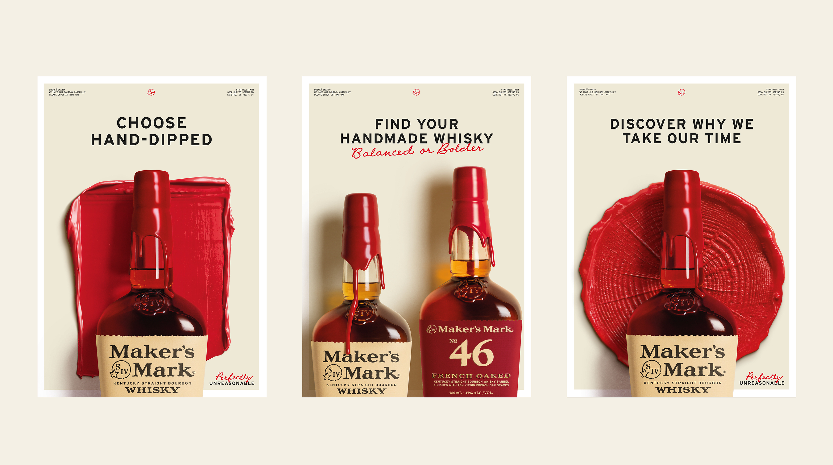
Maker's Mark has launched a refreshed global brand identity, introducing updated typography, a revised color palette, and a new graphic language rooted in the physical materials of its Loretto, Kentucky home. The overhaul, developed with London-based creative agency Turner Duckworth, went live November 17 with the debut of a redesigned website at makersmark.com and will continue rolling out across advertising, retail, events, and experiential activations through 2027.
The Design Logic
The new visual system puts the brand's signature red wax at the center of every touchpoint. Custom typography drawn from founder Margie Samuels's handwriting anchors the identity, while tactile graphic marks were created from natural elements harvested directly at Star Hill Farm—wheat stalks, oak rings, and native flora. The result is a more minimal aesthetic that the brand says preserves the handcrafted sensibility without abandoning its heritage iconography.
"In a world increasingly driven by speed and automation, we still believe some things are worth making slowly, by hand," said Chloe Lloyd-Jones, vice president of global brand marketing at Maker's Mark. Lloyd-Jones noted the design team returned to the farm itself to source raw materials, aiming to build a visual identity that could travel across markets while feeling locally resonant.
What It Means for On-Premise
For bar operators and hospitality buyers, the rebrand signals a sustained investment in brand storytelling at the shelf and at the table. Visual identity refreshes of this scale typically ripple into point-of-sale materials, back-bar signage, bottle presentation, and experiential programming—all touchpoints relevant to on-premise accounts managing premium bourbon placements. Eighth-generation whisky maker and managing director Rob Samuels framed the update as an extension of the founders' original vision rather than a departure from it, emphasizing that the red wax hand-dip, manual barrel rotation, and grain sourcing remain unchanged.
Elements of the identity have already appeared through activations in the United States and China, as well as out-of-home advertising in Australia and the United Kingdom—a signal that the rollout is calibrated for Maker's Mark's growing international footprint. For operators running premium spirits programs, the brand's global consistency push may support cleaner menu integration and more cohesive event tie-ins across markets.
The Maker's Mark rebrand arrives as the broader beverage industry analysis shows premium and super-premium bourbon continuing to hold consumer attention even as overall spirits volume growth moderates. Brands that invest in visual coherence across both digital and experiential channels are increasingly better positioned to command bar-menu real estate and retailer facings. Operators tracking shifts in the premium bourbon segment can find additional context in our restaurant beverage program coverage.
The brand notes that its Star Hill Farm Whisky—named World's Best Wheat Whisky and the first spirit to earn Estate Whiskey certification—inspired the broader creative direction, grounding the new identity in a provenance-first narrative that aligns with current consumer demand for transparency and craft.
Written by Michael Politz, Author of Guide to Restaurant Success: The Proven Process for Starting Any Restaurant Business From Scratch to Success (ISBN: 978-1-119-66896-1), Founder of Food & Beverage Magazine, the leading online magazine and resource in the industry. Designer of the Bluetooth logo and recognized in Entrepreneur Magazine's "Top 40 Under 40" for founding American Wholesale Floral, Politz is also the Co-founder of the Proof Awards and the CPG Awards and a partner in numerous consumer brands across the food and beverage sector.